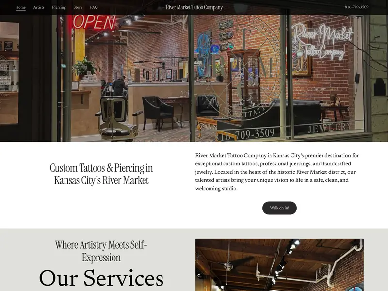
custom tattoos, piercing & handcrafted jewelry · river market, kansas city
visit live siteoverview
River Market Tattoo Company is a custom tattoo and piercing studio at 308 Delaware Street, two blocks off the KC Streetcar. The shop already had a Squarespace site and a reputation. What it did not have was a site that worked hard for either.
The brief was digital efficiency: cut what the site did not need, fix what search engines could not read, and make the things a customer actually wants take one tap instead of four. Not a rebuild. Optimisation on a platform the client owns, in changes that survive Squarespace's own updates and stay editable by the shop.
results
services
phase 1: less site, more shop
The site carried pages nobody meant to publish. Two Squarespace scaffold pages, template and template-1, were live and indexable. Both are gone.
Three more were the same artist's portfolio at three different addresses, which splits the ranking signal for that artist across three URLs competing with each other. A fourth looked like a duplicate and was not: it holds a different artist entirely, filed under the wrong name. Measuring the content rather than pattern matching the addresses is what caught it, and it is the reason that page still exists.
phase 2: what the search engines saw
The site was serving four separate business listings to search engines, three generated by Squarespace and one written by hand. The generated three carried a mangled address with no state and no postcode, and an opening-hours string with two empty days in it.
The hand-written listing was repaired rather than replaced: its cover image pointed at a sixteen-pixel favicon, which disqualifies a listing from the rich results it exists to earn. It now carries the storefront photograph, a description, a contact address and a stable identifier.
phase 3: the header earns its keep
Squarespace allows one button in the header and offers no text element, so a phone number beside it has no native route. The number now sits in the header on desktop and collapses to a call button on a phone, sized to Apple's minimum tap target.
On a phone the bar reads menu, shop name, call, left to right, with the name centred to the pixel. The header stays put when the page scrolls instead of sliding away, and it lost a third of its height, from 91 pixels to 64.
phase 4: the footer becomes useful
The footer held the phone number, the address and the email as plain text. None of them were links. On a phone, the single most common action on a shop's site was select, copy, switch apps, paste.
All three are now links: the number dials, the email opens a message, the address opens directions. The bar was restyled to match the header exactly, sampled rather than eyeballed, and tightened from 90 pixels to 48.
phase 5: pointing at the door
Discovery put walk-ins at the top of the shop's priorities, yet every button on the site led to a form or a gallery. The services call to action now reads walk on in! and opens directions.
For a studio two blocks from a free streetcar stop, directions are the conversion. Treating that click as traffic leaving the site undercounts the thing the client cares about most.
what a platform sets, and what it does not
Search readiness and best practices both score 100, and accessibility sits at 98 with one heading-order fix outstanding. Those reflect the work.
Page speed does not, and saying so is more useful than claiming it. Roughly 800 kilobytes of Squarespace's own scripts load on every page, including the shop bundle, and no amount of client-side work removes them. The ceiling belongs to the platform. Naming which numbers are earned and which are inherited is part of the report.